I recently returned to work following three months of parental leave for the birth of my first child. I spent most of that time doing what you’d expect: staring at the baby for hours, changing hundreds of diapers, and generally alternating between unwarranted confidence and complete uncertainty. But I also found a little time for some other projects, and I’d like to share one of them today.
We used an app called Baby Connect to track feedings, diapers, and other vital information about the baby (this is the app that got the coveted phone home screen real estate that was freed when I uninstalled Slack for my leave). I also had a Fitbit Versa 2 smartwatch, saw that it had an SDK, and decided to try building a custom watch face that would show this data.
How babies work
First, here’s a quick refresher for those of you that haven’t cared for an infant in recent memory. Newborns need to eat every two to three hours, around the clock. They’ll soil about as many diapers as they have feedings. And finally, if pumping and bottle feeding are a part of the feeding plan (as they were for us), mothers are advised to aim for a combined total of at least 8 nursing and pumping sessions per day to ensure enough milk supply. Of course, every baby and every mother is different; no one fits this textbook schedule perfectly. But at least in our case it was close enough to use as a target.
This gives us three kinds of events, all happening on a roughly three hour cadence: feeding (nursing or bottle), milk expression (nursing or pumping), and diaper changes (which also come in two varieties but I’m not distinguishing them here). In Baby Connect, they’re tracked as four line items: bottle, nursing, pumping, and diapers, and a summary view tells you how long it's been since the last event in each category.
Visualizing the data
Once we have the data, what do we do with it? I decided that I didn’t want to just replicate Baby Connect’s textual summary view on my wrist. I like the aesthetic and glanceability of an analog watch face, and I wanted to design something that fit the same mold.
To decide on a visualization method, I thought about what problem I was trying to solve with the watch. Basically what I wanted was a decoder ring for the baby’s cries and fussiness. Is he hungry? Gassy? Upset that he’s sitting in his own filth? Knowing how long it’s been since he was fed or had his diaper changed would be a nice clue.
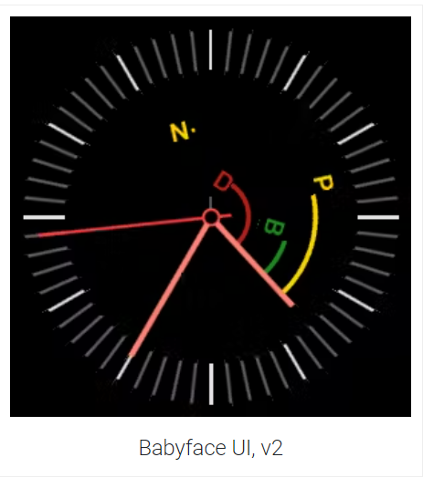
For this, we don’t need to show precise times - just a rough idea of whether the last feeding was, say, within the last hour or nearly three hours ago. Something like a watch’s hour hand will do. Adding four more hands radiating from the center of the watch would be awfully cluttered, but floating a letter or icon at the end of an “invisible hand” could work, and this was my first attempt.
This worked pretty well. I color coded the letters by age (green for less than two hours old, yellow for 2-3 hours, red for 3+) so it would be visible at a glance which needs were oldest. But because of the interactions between the different categories of events, it was a little more subtle than that. Nursing counts as both feeding and milk expression, so a recent nursing would turn both the “pumping” and “bottle” indicators green.
On my next iteration, I added some arcs connecting the letters to the hour hand. This time I was able to make the relationship between the different variables more explicit. There were three arcs, for the three underlying needs we care about (feeding, milk expression, and diapers), and four letters for the actions we’re tracking (Bottle, Nursing, Pumping, Diaper). The arcs were offset to fit in between the actions that affect them. This had the desired effect of making the underlying needs most salient, with the letters just indicating added detail.
Building the app
Fitbit’s SDK is based on SVG, Javascript and CSS. They have a fairly slick online IDE---sign in with your Fitbit account and you can write code in your browser and push it straight to your device. It’s not the best programming environment around but it gets the job done for this small project, and for ease of getting started it’s miles ahead of other mobile platforms I’ve developed for.
The watch has limited computing power and battery life, so apps are split into two pieces: one running on the device itself and a “companion” app running on the linked smartphone. Only the smartphone companion app can reach the internet, so for this app the trickiest part turned out to be passing messages back and forth between the watch and the phone to get updated data without wasting battery power on either device.
I ended up optimizing for battery life. When the app on the watch wakes up (generally triggered by certain wrist movements), it sends a message to the phone requesting updated data. The phone then makes a call to the Baby Connect servers and returns the results to the watch, which updates its display. This results in a delay of a few seconds during which the watch is showing old data. This was slightly annoying, but mainly because I was frequently checking the watch immediately after recording a diaper change just to watch it update. Once that novelty wore off, I stopped checking it so close to the actual events and the delayed updates weren’t a problem any more.
There was one more wrinkle: even though the phone “companion” app feels like it’s running in a server-side node.js-like environment because it has no UI, it’s actually running in a hidden web view. This means that it also has to abide by a browser-like security model. Cookies are not supported in this environment, but they’re required by the Baby Connect API. I worked around this with a simple proxy that translates requests issued from the Fitbit app into the required format. The proxy is based on Tornado, and used repl.it for both writing the proxy and hosting it.
Between Fitbit Studio and repl.it, I was able to complete this entire project in a browser; it wasn’t necessary to install any tools locally (there’s an optional Fitbit simulator which let me iterate a little faster). This was a new experience, but it worked well and after many years of headaches setting up local development environments, this was refreshingly easy.
Growing up and outgrowing the app
All new parents quickly learn that as soon as they think they’ve figured something out about their baby, things change. Three-hour feeding cycles stretch into four, and continue to lengthen and allow more precious sleep. More importantly for the purposes of my little app, it becomes possible to steer feeding times onto a more predictable schedule. Once my son was eating at the same times every day, I stopped checking times on my watch as much. Rather than keep updating the app to track changes in behavior, I switched back to a plain watch face (mainly because third-party watch faces can’t use the Versa 2’s always-on-display).
Even though this was (by design) a short-lived project that went from inception to retirement in a few months, I enjoyed working on it. In many ways it was the polar opposite of my work on CockroachDB - there was no need for rigorous design or testing because the stakes are so low. The “new user signup” experience is clunky, but it didn’t matter because I was the only user. That made it easy to work on in small chunks (mainly while helpful grandparents were visiting and holding the baby). Now that I’m done using it, I’m not planning on doing any more work with this app, but in case anyone is curious, I’ve put the client and server code on GitHub.


